| One Stop for Testing and Tools |
|
Why software quality metrics needed in Agile projects
Gives Insight of the Business Value
There should be at least one software testing metrics that you can present to the senior management and they can comprehend the return value provided by that metrics. In another case, senior management might think that the amount of time and effort invested in the agile testing metrics is not beneficial to the overall business.
Measure Effectiveness
Select one or more metrics to give you information about the effectiveness of your software testing process. Defect detection percentage is one such agile testing metrics.
Measure Efficiency
Your software quality assurance process might be effective, yet there can be room for improvement in terms of efficiency. Defect category, mean time to detect defects and mean time to repair are examples of such testing metrics.
Cost Related
As a general practice, your set of metrics should also have a cost related test metrics.
What is Burndown Chart?
A burndown chart is a graphical representation of work left to do versus time. The outstanding work is often on the vertical axis, with time along the horizontal.
It is useful for predicting when all of the work will be completed.
What is Burn up Chart?
A burn-up chart tracks progress towards a project’s completion. In the simplest form of burn up chart, there are two lines on the chart:
What is a Sprint Burndown chart?
The Sprint Burndown Chart is a visual measurement tool that shows the completed work per day against the projected rate of completion for the current sprint. It provides transparency about the current performance (burndown rate) and allows easy estimation if the Sprint Goal can be reached in time or if the team has to find additional measures to speed-up completion of the remaining activities. The rate of progress of a Scrum Team is called "velocity". It expresses the amount of work in story points completed per sprint. An import rule for calculating the velocity is that only stories that are completed at the end of the sprint are counted. Counting partially finished work (e.g. coding only - test missing) is strictly forbidden.
Business value
It helps the user to understand how quickly your team has completed tasks, and predict when your team will achieve the goal or goals of the sprint.
What does a Burndown chart show?
The chart can help in answering the following questions:
How to read Burndown chart
The burn down chart is simple to understand:
Burndown chart samples
The following samples show the team status based upon the Burndown chart.
Type 1: Sprint commitment met
A burn-down chart in which sprint commitments are met and progress has been smooth over the sprint.
Gives Insight of the Business Value
There should be at least one software testing metrics that you can present to the senior management and they can comprehend the return value provided by that metrics. In another case, senior management might think that the amount of time and effort invested in the agile testing metrics is not beneficial to the overall business.
Measure Effectiveness
Select one or more metrics to give you information about the effectiveness of your software testing process. Defect detection percentage is one such agile testing metrics.
Measure Efficiency
Your software quality assurance process might be effective, yet there can be room for improvement in terms of efficiency. Defect category, mean time to detect defects and mean time to repair are examples of such testing metrics.
Cost Related
As a general practice, your set of metrics should also have a cost related test metrics.
What is Burndown Chart?
A burndown chart is a graphical representation of work left to do versus time. The outstanding work is often on the vertical axis, with time along the horizontal.
It is useful for predicting when all of the work will be completed.
What is Burn up Chart?
A burn-up chart tracks progress towards a project’s completion. In the simplest form of burn up chart, there are two lines on the chart:
- A total work line (the project scope line)
- A work completed line
What is a Sprint Burndown chart?
The Sprint Burndown Chart is a visual measurement tool that shows the completed work per day against the projected rate of completion for the current sprint. It provides transparency about the current performance (burndown rate) and allows easy estimation if the Sprint Goal can be reached in time or if the team has to find additional measures to speed-up completion of the remaining activities. The rate of progress of a Scrum Team is called "velocity". It expresses the amount of work in story points completed per sprint. An import rule for calculating the velocity is that only stories that are completed at the end of the sprint are counted. Counting partially finished work (e.g. coding only - test missing) is strictly forbidden.
Business value
It helps the user to understand how quickly your team has completed tasks, and predict when your team will achieve the goal or goals of the sprint.
What does a Burndown chart show?
- Total Estimate
- Amount of work Remaining or Effort Remaining
- Working Days
- Ideal Effort
- Real Effort
The chart can help in answering the following questions:
- How good is this team with the planning?
- How well is this team executing against the planned stories in a Sprint?
- Is this team self-organized and are they working in unison as a "team"?
- What improvements can this team make?
How to read Burndown chart
The burn down chart is simple to understand:
- X axis for days of the sprint
- Y axis for effort (story points or hours or days depending on what you prefer)
- Ideal line that visualize expected progress
- Real line visualizing the current progress
Burndown chart samples
The following samples show the team status based upon the Burndown chart.
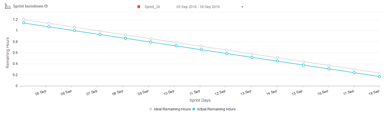
Type 1: Sprint commitment met
A burn-down chart in which sprint commitments are met and progress has been smooth over the sprint.
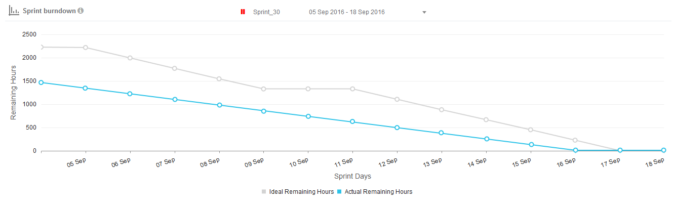
Type 2: Sprint commitment not met
The teams are going at a slower pace and may not be able to complete all the commitments on time. The remaining work then becomes a part of the product backlog and is carried forward to subsequent sprints.
The teams are going at a slower pace and may not be able to complete all the commitments on time. The remaining work then becomes a part of the product backlog and is carried forward to subsequent sprints.
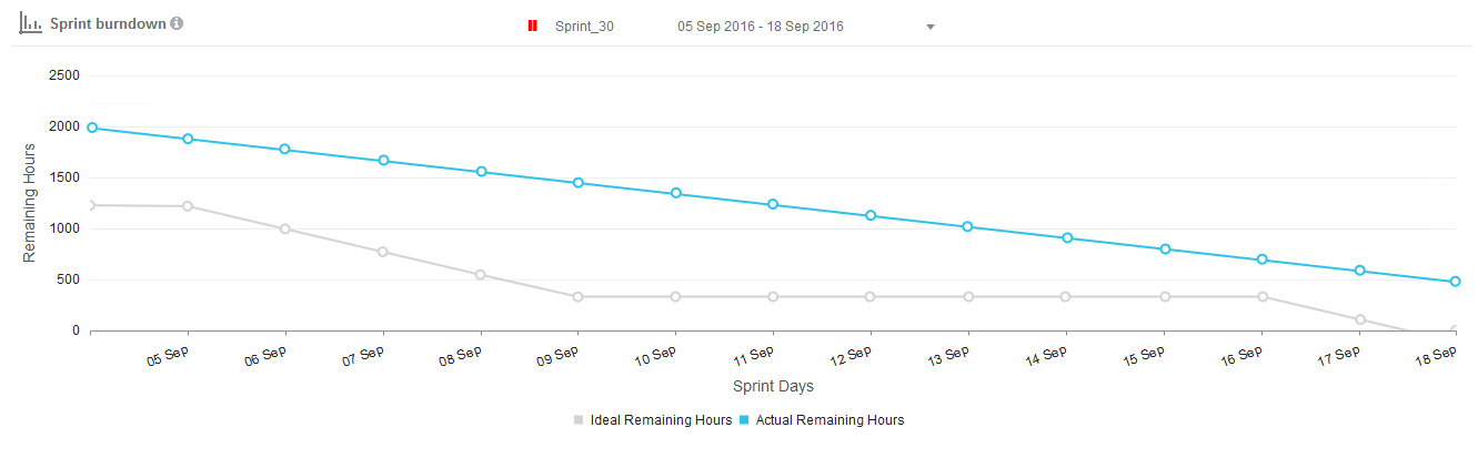
Type 3: Sprint commitment met early before time
It shows that we are going at a better rate and may be able to finish earlier. The stories were probably overestimated; therefore, the team finished them earlier.
It shows that we are going at a better rate and may be able to finish earlier. The stories were probably overestimated; therefore, the team finished them earlier.
Advantages of using Burndown charts
Common mistakes while using Burndown charts
A burn down chart is graphical representation of work left to do versus time. The outstanding work (or backlog) is often on the vertical axis, with time along the horizontal. That is, it is a run chart of outstanding work. It is useful for predicting when all of the work will be completed.
An Example Burn Down Chart:
- Single planning and tracking tool for the team
- Risk mitigation by daily visibility
- Communication tool for customer and other stakeholders
- Placeholder to track retrospective action items
Common mistakes while using Burndown charts
- If the task is too big, then it will make tracking on a daily basis difficult.
- People get confused with the effort spent and the effort remaining. If these are wrongly plotted then the report insight will be inaccurate.
- Forgetting to update the remaining time for tasks will lead to incorrect data.
A burn down chart is graphical representation of work left to do versus time. The outstanding work (or backlog) is often on the vertical axis, with time along the horizontal. That is, it is a run chart of outstanding work. It is useful for predicting when all of the work will be completed.
An Example Burn Down Chart:
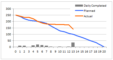
Making a burn down chart in excel
- Step 1: Arrange the data for making a burn down chart
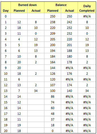
- Step 2: Make a good old line chart
- Step 3: Add the daily completed values to burn down chart
- Step 4: Adjust formatting and colors
Percent of Test Case Execution
The ‘Percent of Test Case Execution’ metrics is indicative of the testing progress in the iteration or sprint. An executed test case may result in a pass, fail or blocked/cannot test status.
Percent of Test Case Execution = {(Number of Passed Test Cases + Number of Failed Test Cases + Number of Blocked Test Cases)/Total Number of Test Cases} *100
This metrics provides a summary of test execution activities. It gives you an insight into the productivity of QA team and the progress of testing activities. Note that some test cases need more time to execute so you cannot judge the efficiency of a QA based on this metrics alone.
Percent of test case metrics should have a value of 100% at the time of completion of software deliverable. If it is not 100%, the team needs to review the unexecuted test cases and make sure that no valid test case is left from execution.
The percent of test case execution does not mean that your targeted QA tasks have been completed successfully. It is possible that you achieve 100% of test case execution, yet there is a lot of QA work remaining. This is because QA team might have executed all test cases, but there can be a lot of failed and blocked test cases that need to be retested unless passed.
Test Case Pass Rate
The test case pass rate indicates the quality of solution based on the percentage of passed test cases. It gives you a clear picture of the quality of the product being tested. Test case pass rate can be calculated by dividing the number of passed test cases with the total number of executed test cases.
Test Case Pass Rate = Number of Passed Test Cases/Total Number of Executed Test Cases
The value of this metrics should increase as the project progress. In case, test case pass rate does not increase in the later stages, it means that due to some reasons the QA team is unable to close the bugs. If test case passes rate decrease, it means that the QA team has to re-open the bugs which are even more alarming.
In both cases, the QA manager needs to collaborate with the development team and need to investigate the causes. It is also possible that the developers are unable to comprehend the reported as they might be ambiguous or poorly reported, not hitting the root cause but symptoms.
Defect Category
Defect category metrics can be used to provide insight about the different quality attributes of the product. The categories may include functionality, usability, performance, security, compatibility.
Defect Category = (Defects in Category X/Total Number of defects in the Product)
If there are more bugs in one category, the QA manager will give special attention to that category in the next iteration or sprint. For example, if there are more functional issues, the QA manager might propose the suggestion to improve the quality and clarity of software requirements specification document.
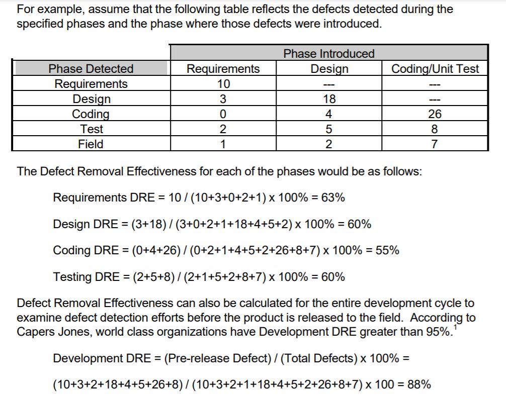
Defect Detection Percentage (DDP)
Defect detection percentage is another important agile testing metrics to determine the quality of your testing process. DDP measures the overall quality of your company’s testing process. It is the ratio of a number of defects identified during testing divided by total defects identified in that phase.
DDP = (Number of Defects detected in a Phase / Total Number of defects in that Phase) x 100
Note that the total number of defects in that phase include the customer reported issues and bugs too.
A greater defect detection percentage indicates a reliable and effective testing process.
Running Tested Features
Running tested features (RTF) is an Agile metric that measures the amount of customer-defined software features verified as functioning by software tests. This metric is helpful because it essentially makes teams more agile by:
The ‘Percent of Test Case Execution’ metrics is indicative of the testing progress in the iteration or sprint. An executed test case may result in a pass, fail or blocked/cannot test status.
Percent of Test Case Execution = {(Number of Passed Test Cases + Number of Failed Test Cases + Number of Blocked Test Cases)/Total Number of Test Cases} *100
This metrics provides a summary of test execution activities. It gives you an insight into the productivity of QA team and the progress of testing activities. Note that some test cases need more time to execute so you cannot judge the efficiency of a QA based on this metrics alone.
Percent of test case metrics should have a value of 100% at the time of completion of software deliverable. If it is not 100%, the team needs to review the unexecuted test cases and make sure that no valid test case is left from execution.
The percent of test case execution does not mean that your targeted QA tasks have been completed successfully. It is possible that you achieve 100% of test case execution, yet there is a lot of QA work remaining. This is because QA team might have executed all test cases, but there can be a lot of failed and blocked test cases that need to be retested unless passed.
Test Case Pass Rate
The test case pass rate indicates the quality of solution based on the percentage of passed test cases. It gives you a clear picture of the quality of the product being tested. Test case pass rate can be calculated by dividing the number of passed test cases with the total number of executed test cases.
Test Case Pass Rate = Number of Passed Test Cases/Total Number of Executed Test Cases
The value of this metrics should increase as the project progress. In case, test case pass rate does not increase in the later stages, it means that due to some reasons the QA team is unable to close the bugs. If test case passes rate decrease, it means that the QA team has to re-open the bugs which are even more alarming.
In both cases, the QA manager needs to collaborate with the development team and need to investigate the causes. It is also possible that the developers are unable to comprehend the reported as they might be ambiguous or poorly reported, not hitting the root cause but symptoms.
Defect Category
Defect category metrics can be used to provide insight about the different quality attributes of the product. The categories may include functionality, usability, performance, security, compatibility.
Defect Category = (Defects in Category X/Total Number of defects in the Product)
If there are more bugs in one category, the QA manager will give special attention to that category in the next iteration or sprint. For example, if there are more functional issues, the QA manager might propose the suggestion to improve the quality and clarity of software requirements specification document.
Defect Detection Percentage (DDP)
Defect detection percentage is another important agile testing metrics to determine the quality of your testing process. DDP measures the overall quality of your company’s testing process. It is the ratio of a number of defects identified during testing divided by total defects identified in that phase.
DDP = (Number of Defects detected in a Phase / Total Number of defects in that Phase) x 100
Note that the total number of defects in that phase include the customer reported issues and bugs too.
A greater defect detection percentage indicates a reliable and effective testing process.
Running Tested Features
Running tested features (RTF) is an Agile metric that measures the amount of customer-defined software features verified as functioning by software tests. This metric is helpful because it essentially makes teams more agile by:
- focusing on features instead of design or infrastructure, and
- verifying each feature as working, producing ready-to-go software at each iteration.
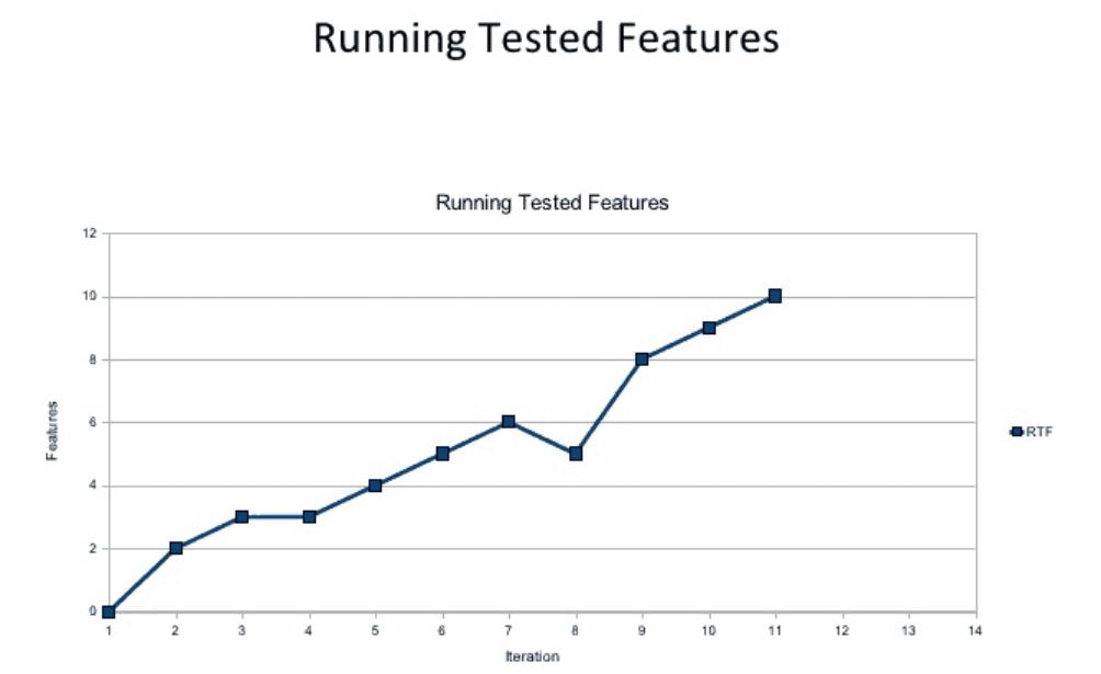
By measuring the RTF growth for a given project, teams can easily analyze whether there are issues with the software coding or the tests used to verify features as functional. The data is visually represented as a line graph based on a count of running tested features, providing easy verification on whether the quantity of running tested features grows with each iteration (as expected).
Defect Leakage
After the delivery of application or product or we can say after the release, if end user or Customer find any defect by using that application then it is called defect leakage, it is also called bug leakage.
How we calculate Defect Leakage?
Assume,
CD=No. of Defects raise by customer after release
DR=No. of Defects raised by Tester before release
ID- No. of invalid Defects from Defects raised by tester before release(Eg. Duplicate, CannotFix, error in test environment etc.)
Formula to calculate Defect Leakage
Defect Leakage=(CD/DR-ID)*100
For Example:
If after release client found 9 defects, during the test, tester reported 201 defects and from these 20 defects were invalid Then,
Defect Leakage = (9/201-20)*100=4.9%
Defect Removal Efficiency
= (I/ I+E) *100
whereI = Pre-delivery (Internal) errors including review defects as well as testing defects and
E = Post-delivery defects (External) or defects found after the release.